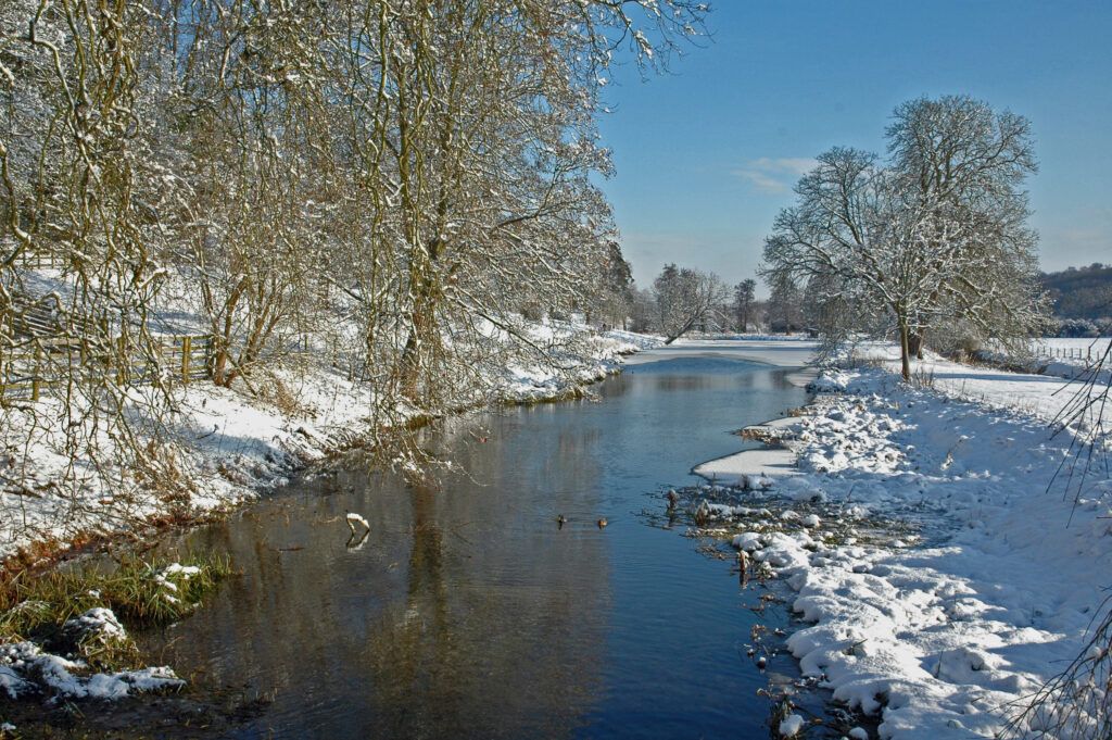
View of the Chess in Winter
“A fantastic endeavour! Congratulations. I was really down there in the water with the spawning trout.”
Member of the Public responding to the project, January 2021
So along with a core team of colleagues from UCL and QMUL Geography and a whole host of partners* I’ve been working on a collection of esri Storymaps since March about the Chess River.
Access the River Chess Observatory with a navigational introduction
Go straight to the River Chess Observatory skipping the introduction
We’ve released them as a informal learning resource for the public’s consumption guided by our partners. The Chess river is an interesting topic to tackle: its a chalk stream, these are typically rich in fauna and flora. However, its subject to a number of issues and pressures common to chalk streams generally.
In this post I’ll be considering how Storymaps have worked as a medium for telling a ‘spatial story’ such as the Chess: one where maps are a key tool for explaining the concepts and problems.
WordPress with Map Widgets
One way to characterise a Storymap is that its very like WordPress, or other cloud based text editors such as Sway but with added widgets (called blocks as in WordPress) that are focussed on map based presentations. For example, one really useful block we’ve used is the map slider (press play on the video):
This allows you to put two maps together so you can compare them, in the above situation, we’re showing how the urban areas in the Chess catchment around Chesham have increased in the modern era (right hand map) compared to the 1940s (left hand map).
We’ve also made use of the sidecar block to present maps/graphs in an explanatory fashion (sensu Andy Kirk in Data Visualisation) where the main point is that we’re doing some interpretation and are presenting it using a data visualisation of some kind. In the example below we’ve used a sidecar block to produce what I call a ‘build’ animation where layers of data are added one by one with relevant explanation as you do it (again, its a video):
Both of these blocks (sidecar and slider) are pretty easy to put them together and esri thoughtfully provide a library of useful maps that you can call on with the map slider.
Collections and Google Analytics
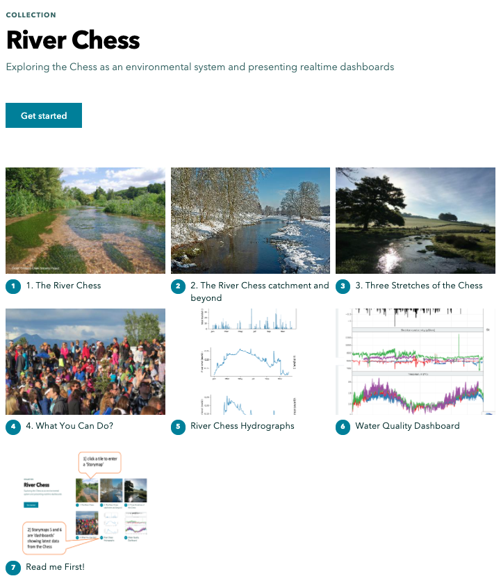
Another neat function that esri have added to Storymaps is collections: you can split your content into multiple Storymaps and present them in a collection, arranged as a set of tiles which the user simply clicks to enter an individual Storymap. In our collection we’ve created four ‘narrative’ Storymaps that logically lead on one to the other like chapters. We’ve also added two Storymaps that act simply as frames to hold data dashboards that my colleague Hefin Rhys (a volunteer from Chesham in the Chess valley!) has programmed using R Shiny. The dashboards hold graphs showing up to date measurements from the Chess, some from the Chesswatch sondes. The idea behind this is that users can come and view the narrative Storymaps and look at the dashboards too but if they want to return to look at the current state of the river (dashboards) they can do that and skip the narrative parts completely.
All of the Storymaps are tagged with Google Analytics codes so that we can track use by the public. This is another advantage of splitting content into multiple story maps, we can see how far users got into the content whereas with just one, big Storymap we’d only know that they accessed it, not where they got to.
*partners, to whom we owe a great deal of thanks include: Esri, Thames water, Affinity water, The River Chess Association. Other help has come from BGS, Hefin Rhys and the reviewers of the materials.