In the Open University, we have developed a suite of LA (Learning Analytics) visualisations called ‘Action for Analytics’ (A4A: slides from a presentation giving more detail) designed to help those responsible for producing modules to see the effects of their designs. For example, it’s possible to track just how much use videos we produce for the module get watched and therefore see whether doing more would be a good investment.
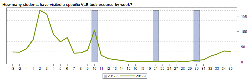
Tracking how many students have accessed a particular section of the module in any week. Weeks along the bottom and blue bars are weeks with Assignments in them.
This has been very successful with our colleagues outside the Learning Design team (mostly academics) being able to track what is going on with their modules real time and also see the effects of changes as they are bought in.
However, the tool is limited to a set of ‘baked in’ dashboards so its not possible to split the above data into students who ended up failing the module from those who passed and compare the two graphs. This could give useful insight into the value of individual parts of a module and also if students are accessing it or not.
Drilling down into the data: A4A isn’t the only route to exploring statistics about students on modules. There are a number of databases underlying the visualisations and these can be accessed directly by specialist staff. Using our access rights, we have been experimenting with producing bespoke visualisations not in the current suite that we think could help those writing and designing modules. These are currently prototypes but show some promise:
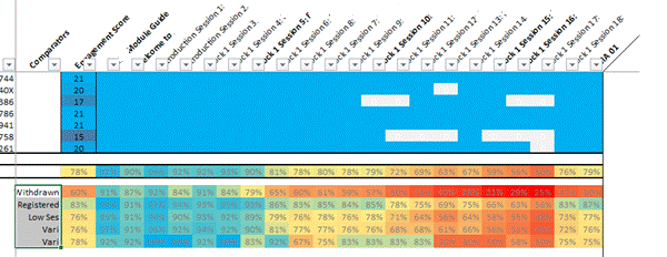
Patchwork quilt visualisation. Sections of the module are arranged in columns, rows at the top represent individual students showing sections they have visited at least once. At the bottom, these individual visits are collated to show percentage access to each element for various groups: Withdrawers at the top, still registered below this and Low economic status (SES) below this.
In this visualisation, individual students are shown one per row at the top. If they have accessed any element of the course (one section per column) the corresponding cell is blue. If they have never accessed it, it’s shown white. At the bottom, students are grouped (e.g. ‘withdrawers’ and ‘registered’ – not withdrawn) and cells are now coloured with hot colours showing low usage and cool colours showing high usage.
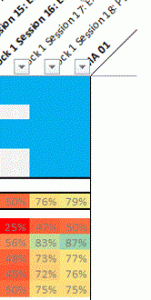
Example Interpretation: As an example of its use, the last column is the block assignment. It can clearly be seen that section 18 (column 2nd from right, expanded up left) is attracting a high percentage of students visiting it at least once. Section 17 (3rd from right) is attracting considerably lower numbers of students, especially amongst withdrawers. This is a factor of inclusion of section 18 in the assignment, whereas 17 is not and, as a result, students are choosing to skip it. From a design point of view, should it be included at all?
More granularity:In our work investigating this graphic, we think it will become even more useful when there are improvements in the granularity, at present we can only see that students have accessed a whole section. For example, it will be much more useful to see how far they got within a section itself – did they give up half way through? Improvements in the learning analytics the VLE records should help with this.
Next Steps: This is a work in progress, already we are making the patchwork quilt visualisation more sophisticated and have plans for other experiments.
In my elearning career I have seen two ed technologies appear that have transformed learning* in my particular areas of interest (web based video and interactive web maps). On Friday, I saw a third: True AI marking via the Gallito tool which was presented by some colleagues from UNED, a Spanish university.
How it works: If you set up an open self assessment question in a course, you can define what the student should answer in terms of topics they should cover. This is then fed into a model which is transferred into an algorithm. Any answer the students give is analysed by the algorithm, it breaks down the text into grammar and then compares this to the answer it has. It gives the students a graph showing how they scored against various criteria. I had lots of questions for the presenters about how this actually works technically, unfortunately the programmers weren’t there to help their education colleagues so I didn’t get very far in understanding it. What they did make clear was that this isn’t a ‘black box’, they haven’t fed in a load of answers to the same questions with a tutors marks and used that to train a marking tool, the algorithm is designed from the ground up.
Testing it: The presenters then went on to show various ways they’ve tested this. UNED (the parent university) is a distance learning university in Spain that is publically funded, they put the algorithm to work assessing students formative work on a business course. Students could try a self assessment question and get immediate feedback: a mark and a graphical representation of where they’re answer was good or bad with respect to the marking criteria was given. Students liked the feedback and were prepared to answer the same question multiple times in order to improve their marks and to develop their understanding. UNED also used the tool to mark pre-exisiting assignments, they found that the tool marked close to the average of a group of makers who also marked the assignments. The human markers on the module varied between them, the tool was marking higher than the hard markers and lower than high markers (on average).
Applications: My description above has been fairly sketchy because it was a quick presentation. However, I believe that they’ve achieved a tool that can semantically break down a student answer and give pretty reasonable feedback. What is immediately obvious is that this is fantastic for formative marking: students building up to an assignment can practice their writing over and over before they attempt the actual assignment without having to involve a tutor at all. That could be a game changer for MOOCs who currently have to rely on multiple choice questions that are poor tools to test high level understanding.
Of course if Gallito does do what is claimed for it, it could also be used to mark students assignments. This area is much more contensious with lots of potential issues brewing. I suspect it will affect this area at some point in the future, just not for now.
Trialling it at the Open University: Along with a colleague, I’m very interested in seeing what the tool can do close up so we’re pushing to get a programme together to investigate it. Our colleagues at UNED are keen we do this.
The rise and rise of AI: I’ve read in the news about AI taking over all kinds of work. I didn’t think it would appear in teaching for a long while, years or even decades. However, it seems its here already. Is this is a disruptive technology that utterly changes education as we know it? I just don’t know. However, I am sure that if the tool proves itself it will be very significant.
Recommendation 1: Higher education institutions should ensure that the effective use of technology for learning and teaching is built into curriculum design processes. This should include consideration of win-win methods, which offer both improved outcomes and lower costs.
Recommendation 2: To support this, the UK higher education sector should develop an evidence and knowledge base on what works in technology-enhanced learning to help universities, faculties and course teams make informed decisions. Mechanisms to share, discuss and disseminate these insights to the rest of the sector will also be required.
Recommendation 3: Institutions that do not currently have learning analytics in place should give consideration to adopting it at the earliest opportunity.
Recommendation 4: Education researchers should consider how the learning analytics big dataset can be harnessed to provide new insights into teaching and learning.
Recommendation 5: Digital technology should be recognised as a key tool for higher education institutions responding to the TEF. Providers should be expected to include information on how they are improving teaching through the use of digital technology in their submissions to the TEF. The Department for Education (DfE) and the TEF panel must ensure the TEF does not act as a barrier against institutions innovating with technology-enhanced approaches.
Recommendation 6: Higher education institutions should ensure the digital agenda is being led at senior levels – and should embed digital capabilities into recruitment, staff development, appraisal, reward and recognition.
Recommendation 7: Academic leads for learning and teaching should embrace technology-enhanced learning and the digital environment and recognise the relationship with other aspects of learning and teaching.
My new employer, the Open University (UK) is doing all of these (and I have responsibility, along with my new team colleagues, for promoting 1 to 4).
This post was originally posted on the closed ALT members list, it seemed to generate interest so I’ve reproduced it here.
The power of little data
Most of what I’ve come across in terms of Learning Analytics is thinking in terms of big data, an example problem: We’re tracking our 300 first years, given the hundreds of measures we have on the VLE and hundreds of thousands of data points, can we produce an algorithm that uses that big data to identify those in danger of dropping out and how should we best intervene to support them. Fine, a worthy project.
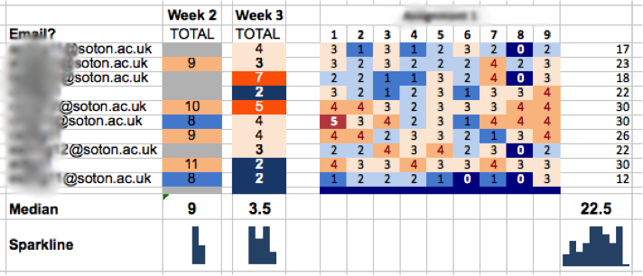
However, it isn’t the only way of tackling the problem. Could we visualize key milestones, say a count of how many of the key course readings a student has accessed each week so that the tutor can easily scan the students’ progress? It would look a bit like this:
At a glance, the tutor can identify non progressing students, she should then be able to drill down for more data (e.g. how much an individual student has been posting in forums) and intervene with the students in whatever way they think best.
The problem becomes one of deciding what key measures should be used (you could even make it customizable at the tutor level so THEY choose the key measures) and how to visualize it successfully. I haven’t seen any VLE learning analytics dashboard that is up to the job IMHO (although I haven’t done a proper search). When compared to big data LA I think this ‘little data’ approach is:
– more achievable,
– has less ethical implications and
– neatly side steps the algorithm transparency problem: its the tutor’s expertise that is being used and that’s been going since teaching was introduced.
The screenshot comes from a prototype system I built to help track progress on a flipped learning course I used to deliver at Southampton Uni, I found that telling the students I was tracking their progress proved an excellent motivator for them to keep up with the out of class activities. Little data and flipped learning was the topic of a talk I did in 2014 at Southampton Uni.
I am responsible for a set of online tutorials (video and audio) and I’ve found Skype unsatisfactory, problems include:
not connecting students who are online to a multiuser call
difficult to understand interface
I’ve done some research and hangouts seems to work well on all the common browsers and mobile devices. My Geo-Google colleagues all swear by it and its also more intuitive which is a common characteristic of Google software IMHO.
ELESIG = elearning evaluation special interest group.
I’ve just been to this meeting at the Royal Veternary college in Camden, London. The talks were interesting and there was some interesting discussion.
Problems engaging staff and students with Learning Analytics: It generally seemed as if Learning Technologists as a group are interested in what I call ‘small data’ i.e. Real time Learning Analytics for tutors and students as opposed to ‘Big data’ which tends to be of interest to management and is often not real time. However, not many people have projects producing results that can be discussed. There are barriers to the use of small data from :
students (not that interested),
tutors (this is too much like Big Brother for me and/or not interested)
Institutions (no clear leadership, not producing drivers to implement little data
Office Mix: I was surprised to find that my implementation of Office Mix (earlier post on Recording a presentation using PowerPoint Mix and see ‘training‘ for details of my teaching on use of Office Mix) as a way of introducing small data to students in the flipped MSc I’m supporting was actually advanced to where a lot of other people were. As I said to the group, the analytics of Office Mix promises much but I have yet to see it in action.
Michelle Milner of UEL: Michelle presented work that UEL has been doing around producing dashboards showing little data to students and tutors. She also explained how they had been using Kontext to track students’ use of Ebooks. One interesting fact she said was that they had done focus groups with students and that by discussing learning analytics students got more interested in the topic! To me this suggests a point made on a JISC podcast about learning analytics I heard recently: reports need to be delivered by a tutor as part of a one on one discussion if at all possible. Michelle noted that in the real world that’s a big ask for a tutor already pushed for time.
Andy Kons: Presented about an excel based program he’d produced to show analytics from Moodle.
“Don’t let anyone tell you certain types of data are not available in Moodle…. it’ll be there somewhere” says @AndyKons at #elesig
 In this visualisation, individual students are shown one per row at the top. If they have accessed any element of the course (one section per column) the corresponding cell is blue. If they have never accessed it, it’s shown white. At the bottom, students are grouped (e.g. ‘withdrawers’ and ‘registered’ – not withdrawn) and cells are now coloured with hot colours showing low usage and cool colours showing high usage.