A whole host of posts/MOOCs have been published about the ‘pivot to online’ – generating online versions of face-to-face teaching to cope with lockdown. One thing that has not been discussed that much is the use of the logs of students using the VLE in this situation, IMHO this analytic technique has great potential to support tutors moving online to track how their new materials are being used. Analysis of such Learning Analytics can answer questions such as:
- What proportion of students have accessed key materials on the VLE by a certain date?
- Which students haven’t engaged with the content of the VLE and are in danger of dropping out completely?
- What items in the VLE are proving unexpectadly popular/unpopular?
Given the effort invested and the speed of generating materials, it seems important to me to answer these questions . It’s possible and advisable to directly ask students via feedback how they are using materials but in most situations, that leads to somewhat vauge and incomplete data to analyse. Learning Analytics do not replace feedback as a way of gauging how students are using learning materials, they are a useful addition and both data sources should be used to assess newly created online materials.
Most discussion I’ve seen (such as UCL’s Connected Learner Extensions Open Courseware) concentrate on question 2 and other questions related to student progress. That is important but in this post I’ll be concentrating on the use of Learning Analytics to inform about the learning design (e.g. questions 1 and 2).
Use of learning analytics is not universally welcomed, some educational technology colleagues regard it as unwarrented student surveillance. I address some of these ethical points in the last section of this post.
Data Visualisation
My experience of using VLE Learning Analytics visualisation ‘out of the box’ is not good: the reporting doesn’t usally visualise the data in a useful way. However, within Moodle (and maybe other VLEs), it’s possible to download the raw Learning Analytics data which can then be visualised using other tools. In order to explore questions [2] and [3] above I wrote a script in R to analyse and visualise the data (download script here). The download is in R Markdown, allowing me to write all the instructions you’ll need to do the analysis on your own Moodle course in the same file as the code. It produces two visualisations:
Cumulative first-hits graph:
To illustrate the script I have used data from a large scale (100+ students) MSc module on the Wolfson Institute (part of Queen Mary’s University London) Psychological Therapies MSc on which I work.
The first shows the first-time hits on a resource against time: a student accessing a resource on a given date contributes to the count if it is the first time they have accessed that resource – returning to a resource at a later date is not recorded. The plot is cumulative, it therefore shows the proportion of students who have accessed a resource by a certain date. In flipped learning this plot can be read to find out what number of students accessed a resource before the face-to-face session, what number accessed it for the first time on the day and how many didn’t look at it until after the related face-to-face session.
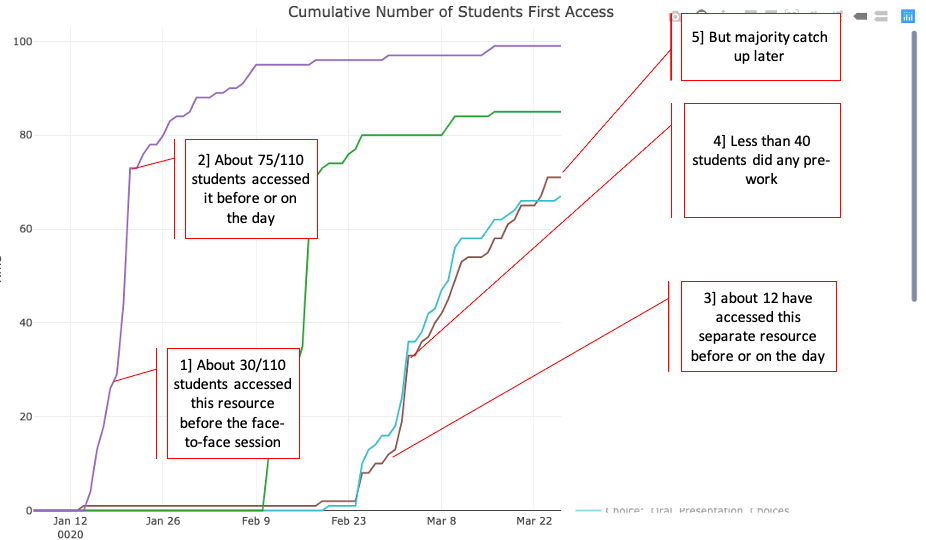
In the example shown above, four resources from a flipped presentation module are shown, two of them (purple and cyan) have had annotations added to illustrate what you can find with this visualisation.
Interpretation: Students are advised to access the resources before the related face-to-face session, the materials are released a week before the class session. A major issue is that students are not using the flipped learning material as designed with the cyan resource – they are skipping the pre-session material before day before the teaching session because they have assignment deadlines to meet. However, the majority of them catch up accessing the resource later.
Grade vs Item heatmap
This visualisation shows the proportion of students who have accessed an item by final course grade. It obviously can’t be used until after the module has ended and marks have been collated. Students are sorted into grade bins (rows) and the columns represent different course items. The colour of each cell represents the proportion (0=none, 1=all) of students in that grade bin accessing the module item. The columns are ordered by when the students should be accessing them as the course unfolds.
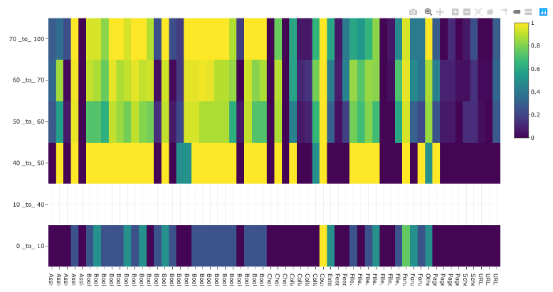
Interpretations:
- It can generally be seen that a lower mark correlates with lower proportion of students accessing items.
- Some items are universally unpopular (dark blue vertical lines) and popular (vertical yellow lines).
- As the course continues, the difference between weaker students and stronger students becomes less defined – even good students are being strategic with their time and skipping materials
- Some items show a strong variation between mark classes in behaviour, these items are worthy of looking at to try and work out why and maybe advise students.
Notes:
The 40-50% bin is anonomolous because only two students were found in this bin and they appeared to have accessed a lot of the popular elements. This illustrates an issue with the visualisation: you need a reasonable number of students in each class to make it representative. It is less useful for small courses (the course illustrated had about 110 students on it)
Ethics
A lot of learning technology colleagues are wary of learning analtyics as they regard them as ‘survellience’, and consider them unethical. I think that viewpoint has value but it doesn’t capture the full story. Certainly, Learning Analytics can be used to spy on students and the data used to in unethical ways. An example would be a commerical web service that gathers personal information on students and sells that information on in a non-trasparent way. However, other uses appear to me to be far more benign, an example is where students group behaviour looking at materials over time is measured (the two visualisations are examples) – the individual student cannot be identified and all data is kept within an institution. If students are made aware of this use of their data, I think it represents an ethical use.
That being said, there are other ethical dangers than the misuse of personal data. Considering just learning analytics could lead to a behaviourist-centric educational approach – for example, did intervention X drive more use of a forum? This is a valid measure of engagement and is easy data to gather but it may fail to measure deeper, more important educational activity. In most situations its more helpful to focus on the depth of learning illustrated by the students posts in the forum. We need to be aware of where our attention is being driven as educators considering Learning Analytics.
In short, analysing learning analytics where students cannot be identified avoids most ethical issues, but not all. More detail.