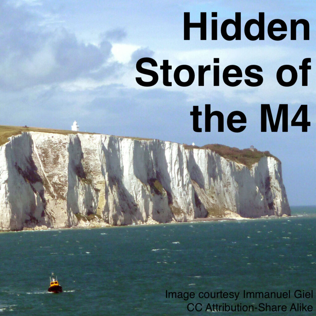
Driving along the M4 is a boring business; the surface landscape, while pleasant enough, is quite forgettable. But below the surface the rocks are far more interesting: as you drive west from London you pass over successively older rocks back through the time of the dinosaurs to the ancient life of earth when animals hadn’t yet left the oceans.
Years ago I was on a boat bobbing around the Portuguese coast on a boat tour looking at fantastic natural caves and arches. I was thinking what a shame it was the locals running the tours weren’t telling us anything about the geological period the rocks came from that had made such amazing formations. It occurred to me that you could have a recorded commentary playing from a loud speaker discussing the geology that played as the boat visited the different sites. And then I realized that you could do the same driving along the M4 as you went junction to junction passing over the different geological periods. I’ve now followed through on my idea and produced three short podcasts for each of the most recent geological periods (Cenazoic*, Cretaceous and Jurassic) in the podcast series “Hidden Stories of the M4”:
Feed link https://www.richardtreves.com/feed/podcast/hiddenstoriesm4
(can be put in your podcast player of choice)
You can listen to individual episodes where you like but I designed it to be played as you drive from London west on the M4. The majority of the podcasts are associated with a particular junction and tell you about the rocks underground at each location. The main topics I cover are:
Individual stories of geologists who discovered the stories such as Mary Anning from the 19th century, now a celebrated paleontologist (fossil expert) but who received little recognition in her own time.
How we’ve used the geology in our buildings
History of life including lots about the age of the dinosaurs.
*Actually, this is a geological era not a period but its about as long as the other two.
A whole host of posts/MOOCs have been published about the ‘pivot to online’ – generating online versions of face-to-face teaching to cope with lockdown. One thing that has not been discussed that much is the use of the logs of students using the VLE in this situation, IMHO this analytic technique has great potential to support tutors moving online to track how their new materials are being used. Analysis of such Learning Analytics can answer questions such as:
What proportion of students have accessed key materials on the VLE by a certain date?
Which students haven’t engaged with the content of the VLE and are in danger of dropping out completely?
What items in the VLE are proving unexpectadly popular/unpopular?
Given the effort invested and the speed of generating materials, it seems important to me to answer these questions . It’s possible and advisable to directly ask students via feedback how they are using materials but in most situations, that leads to somewhat vauge and incomplete data to analyse. Learning Analytics do not replace feedback as a way of gauging how students are using learning materials, they are a useful addition and both data sources should be used to assess newly created online materials.
Most discussion I’ve seen (such as UCL’s Connected Learner Extensions Open Courseware) concentrate on question 2 and other questions related to student progress. That is important but in this post I’ll be concentrating on the use of Learning Analytics to inform about the learning design (e.g. questions 1 and 2).
Use of learning analytics is not universally welcomed, some educational technology colleagues regard it as unwarrented student surveillance. I address some of these ethical points in the last section of this post.
Data Visualisation
My experience of using VLE Learning Analytics visualisation ‘out of the box’ is not good: the reporting doesn’t usally visualise the data in a useful way. However, within Moodle (and maybe other VLEs), it’s possible to download the raw Learning Analytics data which can then be visualised using other tools. In order to explore questions [2] and [3] above I wrote a script in R to analyse and visualise the data (download script here). The download is in R Markdown, allowing me to write all the instructions you’ll need to do the analysis on your own Moodle course in the same file as the code. It produces two visualisations:
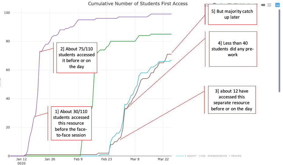
The first shows the first-time hits on a resource against time: a student accessing a resource on a given date contributes to the count if it is the first time they have accessed that resource – returning to a resource at a later date is not recorded. The plot is cumulative, it therefore shows the proportion of students who have accessed a resource by a certain date. In flipped learning this plot can be read to find out what number of students accessed a resource before the face-to-face session, what number accessed it for the first time on the day and how many didn’t look at it until after the related face-to-face session.
In the example shown above, four resources from a flipped presentation module are shown, two of them (purple and cyan) have had annotations added to illustrate what you can find with this visualisation.
Interpretation: Students are advised to access the resources before the related face-to-face session, the materials are released a week before the class session. A major issue is that students are not using the flipped learning material as designed with the cyan resource – they are skipping the pre-session material before day before the teaching session because they have assignment deadlines to meet. However, the majority of them catch up accessing the resource later.
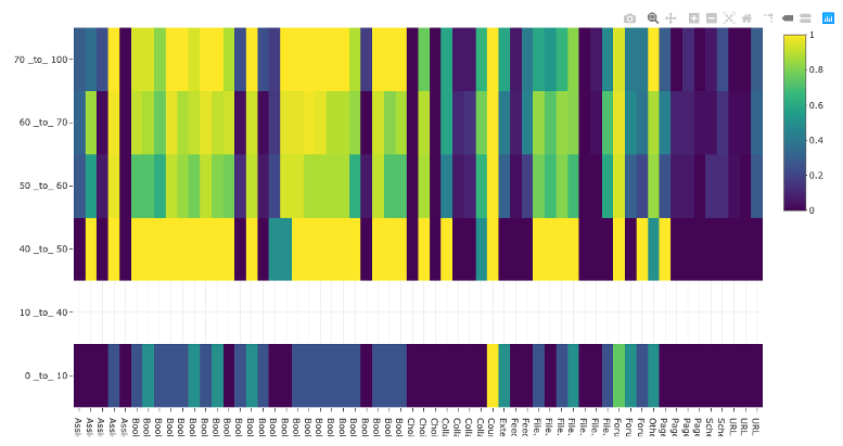
Grade vs Item heatmap
This visualisation shows the proportion of students who have accessed an item by final course grade. It obviously can’t be used until after the module has ended and marks have been collated. Students are sorted into grade bins (rows) and the columns represent different course items. The colour of each cell represents the proportion (0=none, 1=all) of students in that grade bin accessing the module item. The columns are ordered by when the students should be accessing them as the course unfolds.
Interpretations:
It can generally be seen that a lower mark correlates with lower proportion of students accessing items.
Some items are universally unpopular (dark blue vertical lines) and popular (vertical yellow lines).
As the course continues, the difference between weaker students and stronger students becomes less defined – even good students are being strategic with their time and skipping materials
Some items show a strong variation between mark classes in behaviour, these items are worthy of looking at to try and work out why and maybe advise students.
Notes:
The 40-50% bin is anonomolous because only two students were found in this bin and they appeared to have accessed a lot of the popular elements. This illustrates an issue with the visualisation: you need a reasonable number of students in each class to make it representative. It is less useful for small courses (the course illustrated had about 110 students on it)
Ethics
A lot of learning technology colleagues are wary of learning analtyics as they regard them as ‘survellience’, and consider them unethical. I think that viewpoint has value but it doesn’t capture the full story. Certainly, Learning Analytics can be used to spy on students and the data used to in unethical ways. An example would be a commerical web service that gathers personal information on students and sells that information on in a non-trasparent way. However, other uses appear to me to be far more benign, an example is where students group behaviour looking at materials over time is measured (the two visualisations are examples) – the individual student cannot be identified and all data is kept within an institution. If students are made aware of this use of their data, I think it represents an ethical use.
That being said, there are other ethical dangers than the misuse of personal data. Considering just learning analytics could lead to a behaviourist-centric educational approach – for example, did intervention X drive more use of a forum? This is a valid measure of engagement and is easy data to gather but it may fail to measure deeper, more important educational activity. In most situations its more helpful to focus on the depth of learning illustrated by the students posts in the forum. We need to be aware of where our attention is being driven as educators considering Learning Analytics.
In short, analysing learning analytics where students cannot be identified avoids most ethical issues, but not all. More detail.
“A fantastic endeavour! Congratulations. I was really down there in the water with the spawning trout.”
Member of the Public responding to the project, January 2021
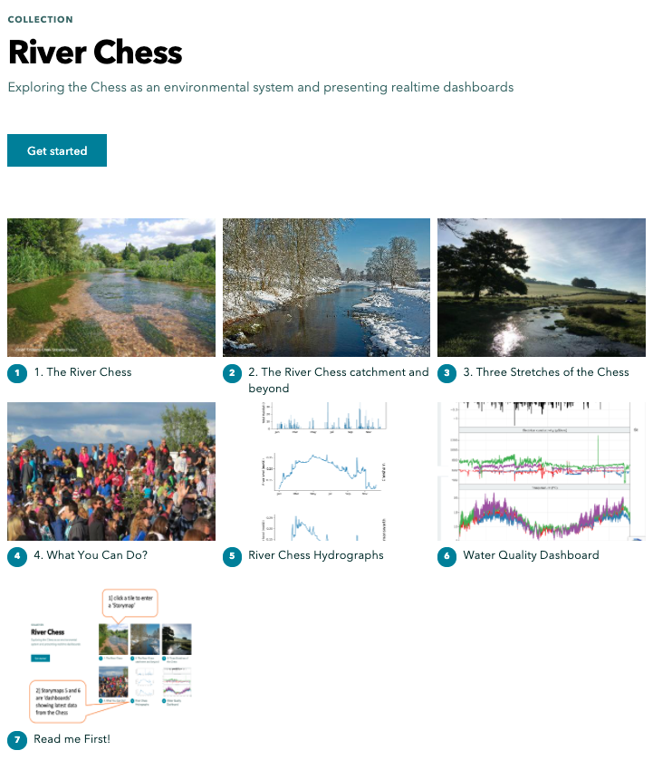
So along with a core team of colleagues from UCL and QMUL Geography and a whole host of partners* I’ve been working on a collection of esri Storymaps since March about the Chess River.
We’ve released them as a informal learning resource for the public’s consumption guided by our partners. The Chess river is an interesting topic to tackle: its a chalk stream, these are typically rich in fauna and flora. However, its subject to a number of issues and pressures common to chalk streams generally.
In this post I’ll be considering how Storymaps have worked as a medium for telling a ‘spatial story’ such as the Chess: one where maps are a key tool for explaining the concepts and problems.
WordPress with Map Widgets
One way to characterise a Storymap is that its very like WordPress, or other cloud based text editors such as Sway but with added widgets (called blocks as in WordPress) that are focussed on map based presentations. For example, one really useful block we’ve used is the map slider (press play on the video):
Video of me using the map swipe block in Storymaps
This allows you to put two maps together so you can compare them, in the above situation, we’re showing how the urban areas in the Chess catchment around Chesham have increased in the modern era (right hand map) compared to the 1940s (left hand map).
We’ve also made use of the sidecar block to present maps/graphs in an explanatory fashion (sensuAndy Kirk in Data Visualisation) where the main point is that we’re doing some interpretation and are presenting it using a data visualisation of some kind. In the example below we’ve used a sidecar block to produce what I call a ‘build’ animation where layers of data are added one by one with relevant explanation as you do it (again, its a video):
Both of these blocks (sidecar and slider) are pretty easy to put them together and esri thoughtfully provide a library of useful maps that you can call on with the map slider.
Collections and Google Analytics
A screenshot showing the ‘collection’
Another neat function that esri have added to Storymaps is collections: you can split your content into multiple Storymaps and present them in a collection, arranged as a set of tiles which the user simply clicks to enter an individual Storymap. In our collection we’ve created four ‘narrative’ Storymaps that logically lead on one to the other like chapters. We’ve also added two Storymaps that act simply as frames to hold data dashboards that my colleague Hefin Rhys (a volunteer from Chesham in the Chess valley!) has programmed using R Shiny. The dashboards hold graphs showing up to date measurements from the Chess, some from the Chesswatch sondes. The idea behind this is that users can come and view the narrative Storymaps and look at the dashboards too but if they want to return to look at the current state of the river (dashboards) they can do that and skip the narrative parts completely.
All of the Storymaps are tagged with Google Analytics codes so that we can track use by the public. This is another advantage of splitting content into multiple story maps, we can see how far users got into the content whereas with just one, big Storymap we’d only know that they accessed it, not where they got to.
*partners, to whom we owe a great deal of thanks include: Esri, Thames water, Affinity water, The River Chess Association. Other help has come from BGS, Hefin Rhys and the reviewers of the materials.
Since March last year I’ve been working on a project using esri StoryMaps. Its a neat tool which requires no coding to use, designed to enable you to produce a scrollytelling story with a spatial slant – mostly by enabling you to produce useful maps/map-based-animations. A scrollytell animation uses the simple action of scrolling to drive an unfolding story with text, video and animations, arguably, they date back to 2012 and a story called ‘Snow Fall’, a Purlitzer winning story and graphical delight (nice history and future of scrollytelling).
Here’s a video showing how easy StoryMaps are to create:
Telling a spatial story on the web using animated maps isn’t limited to StoryMaps, there are other free tools such as Google Earth Tour builder (tutorial howto) which will allow you to produce a different type of spatial story. I use the term ‘Atlas Tour‘ to describe these different types of platforms.
When I was teaching at Southampton University, I got undergraduate students to create an Atlas Tour (using Google Earth Tours which was state of the art at the time). I allowed students to choose their own story, I quickly discovered was that students sometimes struggled with choosing a good topic for an Atlas Tour. Students often identified a topic that had a map that goes with it or involves spatial data but that still didn’t make for a great Atlas Tour, the spatial component of the narrative has to form the ‘spine’ of the story – it has to be the main story.
A lovely example of an Atlas Tour we’ve already mentioned is ‘Snow fall’, if you’ve never read/watched it you’re in for a treat.
An example of a non-Atlas Tour would be a topic that my partner works with as a medical statistician: the performance of surgeons at different English hospitals over a year. You have data about where the surgeons work so in theory you could make a map and plot on it performance data in some way. However, the story is really about how individual surgeons are doing, its about people not place so it doesn’t make a great Atlas Tour.
A topic that does make a great Atlas Tour can involve data that isn’t based around maps at first glance. Take the case of basketball, players take shots from different parts of the court. These shot locations can be collated and analysed using GIS techniques producing ‘court maps’ that make great Atlas Tours. Here’s an example story that could be put into an Atlas Tour platform like StoryMaps.
Identifying good topics for an Atlas Tour isn’t easy for the inexperienced but, if I were to put it in a nutshell, I’d say it boils down to :
“Is there a map that is the essence of the story?”
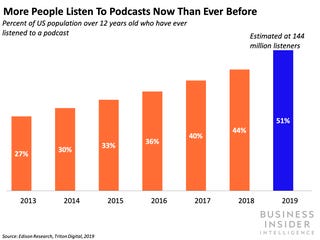
You may have noticed that podcasting is having a bit of a moment: it used to be a faff to download podcasts to your computer then sync with your iPod/other player. However, the rise of the smart phone has solved that issue with software handling automatic downloads from the web so the latest podcast in a series is always on your phone waiting for you.
This has enabled a steady year on year rise in the numbers using podcasts over the last decade, users are listening on commutes and other dead time when they can’t read or watch anything.
A characteristic of this audio consumption is that it holds the user’s attention better – people can easily click away when they’re watching a video in a browser or scanning some text but this happens less to those listening to audio. These factors mean that podcasts are ripe for use in education, uses in language learning are well known and common but podcasts could serve a number of purposes in all topic areas:
Extra material for a module especially one-on-one discussions or interviews
Summarys of teaching sessions or of feedback to a whole class on an assignment
With that in mind I’ve been experimenting by producing a podcast about learning R programming to investigate the practicalities in education (webpage and feed for putting into your podcasting app).
In educational terms, this is what I’d term a ‘sidecar’ podcast, its meant to cover general topics of interest to anyone learning R programming for the first time, its not specifically tailored to a particular course (in falls in section [1] of my list above). Because of the organisation involved and because of Covid lockdown, I’ve done it on my own. I think a two way discussion between presenter and interviewer or just a two way discussion would be a nice alternative. My ex-colleagues at the OU run a lovely example combining learning about pedagogy through the lens of TV/film with two main presenters and the occaisional guest expert.
Practicalities:
Podcasting is relatively simple to produce compared to video or multimedia. However, it certainly isn’t as simple as text. There are plenty of resources on how to do it but here are some quick pointers I picked up:
Quality Mic: Invest in a quality microphone, listening to poor quality audio, especially on a commute with lots of background noise, is tiring for the student/user. A blue Yeti second hand will set you back about 60 pounds.
Summarising or repeating content (in some way that avoids being boring) is helpful for understanding in a podcast – users tend not to track back to listen to something again in the way they would with text.
Intonation: Speak in an informal way and try and vary intonation: users are missing the visual clues of your face mouthing the words and this makes up for it. Unless you really know what you’re doing, avoid reading from a script, it comes out dull and lifeless.
Editing Sofware: To edit out ‘umms’ and ‘errs’ and prepare your content, Audacity is free and has proved fine for my use.
Hosting: I hosted Learning R on my own WordPress site, using Seriously Simple podcasting. For a first go podcast, there are plenty of free hosting packages available such as podbean.
My colleagues Maria Turri and Bridget Escolme are running writing retreats for their Creative Arts and Mental Health Masters students currently working on their dissertations without other teaching. The basic idea is that everyone gets together and works in a supportive atmosphere with some supportive group and buddy chatting at defined times. The students really appreciate it and it obviously fits with these Covid19 times where students don’t have a physical shared space to socialise in. The following text is the outline used for an upcoming session, it neatly provides more detail.
Text shared with students
For those of you who have not attended before, be reassured that this is an opportunity to get on with some writing, with no scrutiny about what you have written or about your progress. The benefit comes from having a structured time where everyone writes (and struggles!) together.
An indicative timetable is here below. Take care and see you then, Maria
10.00 – 10.10 (afternoon: 2.00-2.10)
Maria sets up the retreat, explains the principles for anyone new: switch off your devices, do not consult papers or other sources, try and be in a space where you can work uninterrupted (unless you have essential duties to perform or attend to).
10.10- 10.30 (afternoon: 2.10-2.30)
– 20 minutes free writing on any dissertation-related topic.
10.30 – 10.40 (afternoon: 2.30-2.40)
– check in with partner (break out groups in pairs) – let them know what you wrote about in the free writing time and what your goal is for the next writing time, e.g. ‘to write something about…’
10.40 – 11.40 (afternoon: 2.40-3.40)
– 1 hour writing time, writing something under the topic you discussed with your partner.
11.40 – 11.50 (afternoon: 3.40-3.50)
– check in with partner. Tell them how you did with your goal and what your next one is going to be.
11.50 – 12.10 (afternoon: 3.50-4.10)
– break. Please take this whole 20 minutes as a break and if it’s possible to do so, go outside or into another part of your living space. At least be sure to turn away from the screen. Please don’t switch on your phone or check any emails or social media.
12.10 – 12.50 (afternoon: 4.10-4.50)
– 40 minute writing time, writing something under the topic you discussed with your partner.
12.50 – 1.00 (afternoon: 4.50-5.00)
– check in with partner, or with whole group if we’re only a small group. Tell them how you did with your goal.
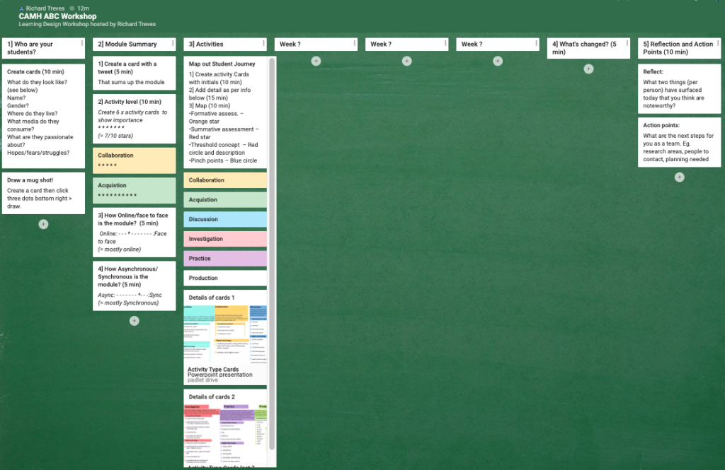
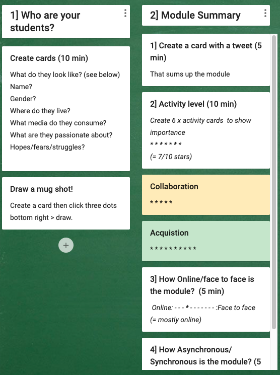
The ABC Workshop is a well known learning design activity to help module teams design modules based on face-to-face interaction and writing things on cards and moving them around on boards. I did one for some colleagues a couple of weeks ago but we had to do it remotely because of lockdown. I thought I’d share my findings and thoughts on what software to use and how it went.
My first thought on how to do it was to organise a web conferencing session with a shared whiteboard and use the whiteboard in the same way as the cards and sheets are used in a face-to-face ABC workshop. At QMUL I had the choice of using Blackboard Collaborate or MS Teams. With a bit of experimenting it soon became apparent that they weren’t up to the job so I moved onto thinking about using web conferencing with an external platform. Here are the platforms I considered:
Miro: Looked nice as you could create virtual postit notes on a drawn background but it requires users to create IDs and login so I rejected it.
Trello:Allows a set of columns to be set up and cards to be moved around on them just as in a workshop. A nice template to use if you’re interested. The problem is that you need to login to interact as users and also it isn’t accessible so I rejected this.
The padlet used in the workshop
Padlet:Allowed users to access a board and interact without logging in, this seemed helpful and to avoid messing about at the start of the session. Although it isn’t accessible, they’re working on it which is very good to hear. I chose to set up the board in columns which would represent the weeks on a standard ABC sheet. The disadvantage is that dragging cards from column to column is not possible, you have to go through a multi-click operation to move cards from one column to another.
My approach has been done in more detail by Laurea University who have written it up in detail. However, there are some significant differences:
Whole workshop on padlet: Instead of using padlet just for the main storyboard, I used it for the whole workshop. The early radar graph and tweet activity sheet were converted to columns to fill in (column [2] below. I think the radar graph is unecessary, a simple system of stars on cards is readable in much the same way. The advantage of doing this is that there is less messing about in the workshop switching between media.
Screenshot of the padlet used for the session, first two columns.
Who are your students?: Inline with the Open Universities learning design workshops I have an activity based around thinking about who your students are (column [1] above).
How did it go? The ABC workshop worked well, the technology wasn’t a problem and numbering the columns helped with moving the team on to keep within 90 minutes. The team I was working with were very well motivated and I’d kept the numbers low (two of them) deliberately to limit complications.
Wrapping up: A nice thing about the padlet is that the notes from the session are a lot easier to write up afterwards, no deciphering scribbled hand writing! Its also important to set the privacy (Share (top right corner of the padlet screen) > change privacy) of the padlet so your users can create and edit padlet cards. The UCL ABC team have written about delivering workshops in lockdown.
In the Open University, we have developed a suite of LA (Learning Analytics) visualisations called ‘Action for Analytics’ (A4A: slides from a presentation giving more detail) designed to help those responsible for producing modules to see the effects of their designs. For example, it’s possible to track just how much use videos we produce for the module get watched and therefore see whether doing more would be a good investment.
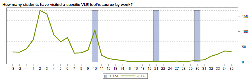
Tracking how many students have accessed a particular section of the module in any week. Weeks along the bottom and blue bars are weeks with Assignments in them.
This has been very successful with our colleagues outside the Learning Design team (mostly academics) being able to track what is going on with their modules real time and also see the effects of changes as they are bought in.
However, the tool is limited to a set of ‘baked in’ dashboards so its not possible to split the above data into students who ended up failing the module from those who passed and compare the two graphs. This could give useful insight into the value of individual parts of a module and also if students are accessing it or not.
Drilling down into the data: A4A isn’t the only route to exploring statistics about students on modules. There are a number of databases underlying the visualisations and these can be accessed directly by specialist staff. Using our access rights, we have been experimenting with producing bespoke visualisations not in the current suite that we think could help those writing and designing modules. These are currently prototypes but show some promise:
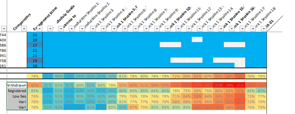
Patchwork quilt visualisation. Sections of the module are arranged in columns, rows at the top represent individual students showing sections they have visited at least once. At the bottom, these individual visits are collated to show percentage access to each element for various groups: Withdrawers at the top, still registered below this and Low economic status (SES) below this.
In this visualisation, individual students are shown one per row at the top. If they have accessed any element of the course (one section per column) the corresponding cell is blue. If they have never accessed it, it’s shown white. At the bottom, students are grouped (e.g. ‘withdrawers’ and ‘registered’ – not withdrawn) and cells are now coloured with hot colours showing low usage and cool colours showing high usage.
Example Interpretation: As an example of its use, the last column is the block assignment. It can clearly be seen that section 18 (column 2nd from right, expanded up left) is attracting a high percentage of students visiting it at least once. Section 17 (3rd from right) is attracting considerably lower numbers of students, especially amongst withdrawers. This is a factor of inclusion of section 18 in the assignment, whereas 17 is not and, as a result, students are choosing to skip it. From a design point of view, should it be included at all?
More granularity:In our work investigating this graphic, we think it will become even more useful when there are improvements in the granularity, at present we can only see that students have accessed a whole section. For example, it will be much more useful to see how far they got within a section itself – did they give up half way through? Improvements in the learning analytics the VLE records should help with this.
Next Steps: This is a work in progress, already we are making the patchwork quilt visualisation more sophisticated and have plans for other experiments.
In my elearning career I have seen two ed technologies appear that have transformed learning* in my particular areas of interest (web based video and interactive web maps). On Friday, I saw a third: True AI marking via the Gallito tool which was presented by some colleagues from UNED, a Spanish university.
How it works: If you set up an open self assessment question in a course, you can define what the student should answer in terms of topics they should cover. This is then fed into a model which is transferred into an algorithm. Any answer the students give is analysed by the algorithm, it breaks down the text into grammar and then compares this to the answer it has. It gives the students a graph showing how they scored against various criteria. I had lots of questions for the presenters about how this actually works technically, unfortunately the programmers weren’t there to help their education colleagues so I didn’t get very far in understanding it. What they did make clear was that this isn’t a ‘black box’, they haven’t fed in a load of answers to the same questions with a tutors marks and used that to train a marking tool, the algorithm is designed from the ground up.
Testing it: The presenters then went on to show various ways they’ve tested this. UNED (the parent university) is a distance learning university in Spain that is publically funded, they put the algorithm to work assessing students formative work on a business course. Students could try a self assessment question and get immediate feedback: a mark and a graphical representation of where they’re answer was good or bad with respect to the marking criteria was given. Students liked the feedback and were prepared to answer the same question multiple times in order to improve their marks and to develop their understanding. UNED also used the tool to mark pre-exisiting assignments, they found that the tool marked close to the average of a group of makers who also marked the assignments. The human markers on the module varied between them, the tool was marking higher than the hard markers and lower than high markers (on average).
Applications: My description above has been fairly sketchy because it was a quick presentation. However, I believe that they’ve achieved a tool that can semantically break down a student answer and give pretty reasonable feedback. What is immediately obvious is that this is fantastic for formative marking: students building up to an assignment can practice their writing over and over before they attempt the actual assignment without having to involve a tutor at all. That could be a game changer for MOOCs who currently have to rely on multiple choice questions that are poor tools to test high level understanding.
Of course if Gallito does do what is claimed for it, it could also be used to mark students assignments. This area is much more contensious with lots of potential issues brewing. I suspect it will affect this area at some point in the future, just not for now.
Trialling it at the Open University: Along with a colleague, I’m very interested in seeing what the tool can do close up so we’re pushing to get a programme together to investigate it. Our colleagues at UNED are keen we do this.
The rise and rise of AI: I’ve read in the news about AI taking over all kinds of work. I didn’t think it would appear in teaching for a long while, years or even decades. However, it seems its here already. Is this is a disruptive technology that utterly changes education as we know it? I just don’t know. However, I am sure that if the tool proves itself it will be very significant.
Recommendation 1: Higher education institutions should ensure that the effective use of technology for learning and teaching is built into curriculum design processes. This should include consideration of win-win methods, which offer both improved outcomes and lower costs.
Recommendation 2: To support this, the UK higher education sector should develop an evidence and knowledge base on what works in technology-enhanced learning to help universities, faculties and course teams make informed decisions. Mechanisms to share, discuss and disseminate these insights to the rest of the sector will also be required.
Recommendation 3: Institutions that do not currently have learning analytics in place should give consideration to adopting it at the earliest opportunity.
Recommendation 4: Education researchers should consider how the learning analytics big dataset can be harnessed to provide new insights into teaching and learning.
Recommendation 5: Digital technology should be recognised as a key tool for higher education institutions responding to the TEF. Providers should be expected to include information on how they are improving teaching through the use of digital technology in their submissions to the TEF. The Department for Education (DfE) and the TEF panel must ensure the TEF does not act as a barrier against institutions innovating with technology-enhanced approaches.
Recommendation 6: Higher education institutions should ensure the digital agenda is being led at senior levels – and should embed digital capabilities into recruitment, staff development, appraisal, reward and recognition.
Recommendation 7: Academic leads for learning and teaching should embrace technology-enhanced learning and the digital environment and recognise the relationship with other aspects of learning and teaching.
My new employer, the Open University (UK) is doing all of these (and I have responsibility, along with my new team colleagues, for promoting 1 to 4).


 In this visualisation, individual students are shown one per row at the top. If they have accessed any element of the course (one section per column) the corresponding cell is blue. If they have never accessed it, it’s shown white. At the bottom, students are grouped (e.g. ‘withdrawers’ and ‘registered’ – not withdrawn) and cells are now coloured with hot colours showing low usage and cool colours showing high usage.